***Interesting Article***
Images Used
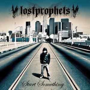
- 2 eagles
- road or trainline on a bridge?
- high rise buildings of the city in the distance
- lone figure in a hoodie and jeans
- black, blue and white colour scheme
Text
- lostprophets typical symbol at the top - first thing you see, bold, important - not capitalised (not formal??fun??)
- swirly writing for album cover name at the bottom - hadnwriting, caligraphy, samller (less important) -> more personal
Anchorage
-colour scheme of blue, black and white
- album title
Iconography
-the eagle is present in a lot of lost prophets merchandie - could be said to be their logo (distinguishing)
Audience
-Both a male and a female target audience (men idolise them, woman fancy them etc)
-Young teens to possibly mid 20s although that may be pusing it)


